
I’d like to do something different today and share a bit about how my process works. Many people who see my artwork remark that it’s not immediately apparent how my images are made. If you’d prefer not to read about the sausage-making process and just see the photo that inspired the finished piece, it’s OK — you can scroll to the end.

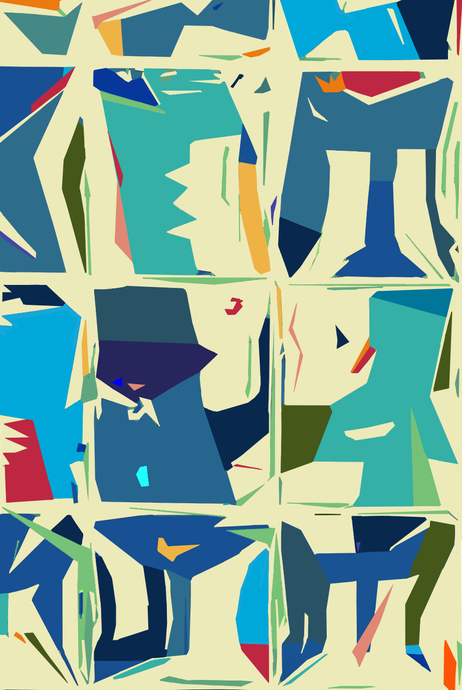
This image, Blue Window Party, is a good example of my primary genre, which I describe as photograph-based digital art. My own digital photos are the starting point. I take a photo, then, on my iPad, I use different photo editing programs and digital art drawing/painting technology to draw my picture overtop of my photo. I use the underlying photo as a scaffold for the final image. Sometimes I’m driving the bus, and sometimes the photo is.
Basically, I work in tandem with the photo to modify, add to and transform it — or more specifically, those elements of it I want to keep — to fit my vision for the finished piece. I may also use printmaking techniques, collage, combining photographs, or painting and drawing by hand. Most of the time my finished pieces are the result of a combination of digital and non-digital techniques.
What do I take pictures of? Anything that that strikes a chord and resonates with and inspires me — the subject matter can be everyday or exotic. Why do I do this? I think the root motivation is that I want to capture moments — of beauty, energy, intrigue, humor, or emotion — that are worthy of remembering, so they aren’t lost in time.
Sometimes what I photograph represents just a seed of an idea, or the broad outlines of a composition I want to complete. So the final image may not end up resembling the original photo at all. This piece is kind of in-between: you can definitely still see the underlying photo in the finished product, but almost every aspect of it has been altered, sometimes dramatically, because it’s been fused with and changed by my own drawing based on that photo.
On the attached “Blue Window Party – The Process” timeline, look at the first photo, a reflection on office building windows in Tysons Corner, Virginia. That’s the launching pad photo — the basis for Blue Window Party. I loved how the reflection of the building in the glass windows moved and formed unusual shapes as I walked past it.
The movement and fluidity of those irregular forms had a kinetic, festive, almost musical energy that I wanted to capture, so I snapped a few photos. (Maybe it also subconsciously brought back memories of office parties when I was a lawyer, though I hesitate to say that because for most people, going to a party with a bunch of lawyers is very distant from their definition of fun.)
Lately, about 80% of my photos are taken with an iPhone. I never know when inspiration will strike, and I don’t always carry the big fancy camera with me.
Now look at the second photo – a zoomed-in section of the original photo that shows just a few of the windows. To me, those were the key shapes, my favorite shapes within the photograph, and that’s what I chose as the basis for the artwork. I knew I was going to use different colors for the final image, to more strongly convey festivity and movement.
I didn’t know exactly what the finished piece would look like when I started — I just had that seed of an idea. I knew the feeling I wanted to communicate, and I knew that I wanted to make the larger forms and shapes different shades of blue, so they’d still look somewhat like windows. I also knew I wanted to add lots of small pops of brighter colors.
I love the color palettes of midcentury art and décor, and this piece ended up having a lot of midcentury-type colors. I didn’t have the word “party” in my head when I started, but it quickly came into my mind as the key word soon as I started work on it.
I’ll try not to smother you in minutiae, but briefly: on the iPad, I used a basic photo editing program to reduce the detail of it down to its most basic shapes. Then, using a simple digital drawing program, I drew my own shapes and lines and details over it. I didn’t consciously decide to ahead of time, but I used a high-contrast, angular, poster-ish drawing style that the final image needed, to achieve the bold, upbeat vibe I wanted.
I added and deleted elements from the photo, constantly tweaking and changing the composition of the drawing as I went along. I changed some of the positive spaces to negative spaces and vice versa. I edited, erased, doodled, drew and redrew my work over the picture, and kept on rearranging all those spinning plates on sticks until the composition made sense to me.
After that, I added colors, which are obviously very different ones from the initial photo. Some color choices were easy, while others were difficult and took a long time to feel right. Making the background that warm cream color was a hugely important choice, because once that was in place, it gave me the most detailed picture in my mind of the finished window party.
I had to keep zooming in and out as I worked on each section of the image, because each rectangle – which was based on each window pane from the photograph – had to work both on its own and together with the other rectangles. This was one of the biggest challenges, because even little changes to one affected its harmony with the others.
Artists always get asked when they know an image is finished. For me, it’s easy to tell when the finish line is close, but it’s rare for me to look at a piece and consider it 100% done. I always see little changes I want to make, or at least give them a try. I try to make the call that it’s done when the unhelpful final touches start to outweigh the helpful final touches. But I often get so absorbed in the creative process that I don’t want to stop even when I should. It’s like eating salt & vinegar potato chips – sometimes they’re so addictively good that you keep on eating them even after they make your mouth bleed. (I’m sorry, but that’s the perfect analogy, despite the gratuitous bloodletting.)
To wrap up, it’s hard to describe how you make art. Sometimes, when I listen to artists talk about process, it sounds inventive and magical, but other times it can sound (please excuse the language, but for lack of a better term) like utter horse shit. So I understand that what’s described here could come off as alien, childlike, unimportant, pretentious or just gobbledygook. I hope it hasn’t — I’ve done the best I can to give you a brief glimpse of how I got from inspiration to finished product.
I urge you to keep an open mind about art, because sometimes you don’t realize what can surprise, challenge, and delight you. But I can’t control what you think, and it’s not our place to judge each other. If this isn’t your bag, we can respectfully and amicably agree to disagree — in the words of H.I. McDonough in the movie Raising Arizona (brilliantly played by Nicholas Cage, in his not-as-turbo-weird-as-he is-now prime of his career), “I’m OK, you’re OK, and that there’s what it is.”
As I say in my artist’s statement, which all art shows require you to submit to along with your artwork: I want to grab the viewer (but not in a bad way). Basically I want my artwork to make you feel something – emotion, energy, an appreciation of beauty, inspiration, a different perspective, puzzlement at what on earth I was thinking, or anything else, big or small, that makes the moment after you look at the image different for you than the moment before. It doesn’t have to be what I felt, but I hope you felt something. Party on, dudes.
